




Transparency in design starts with a simple question: what does someone need to know before they choose? Yet many design decisions begin with what looks best. A polished screen gets our attention, while an important detail ends up in a footnote.
That detail might be a renewal fee, a limit, or a catch. Although it takes up little space, it could change someone’s mind.
So, here is a thought experiment.
What transparency in design could look like
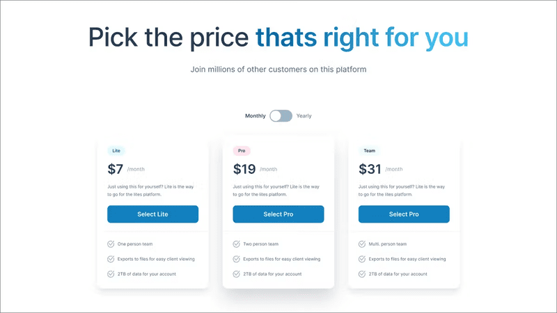
Imagine a subscription page. The introductory price looks great in large, bold type. Below it, a small line explains that the price doubles after three months.
Now give both prices equal weight. Suddenly, the offer feels different, even though the facts have stayed the same.
The same idea applies to a dashboard. A number might look precise, but perhaps it is based on old or incomplete data. Adding a clear label helps someone judge how much to trust it.
Similarly, a recommendation becomes more useful when people can see why it was made.
These changes may make a screen less tidy. They may also cause someone to pause before clicking. But that pause can serve a purpose: it gives them room to make an informed choice.
Leave our egos at the door
Before a design workshop, I often say:
“We need to leave our egos and preconceptions at the door.”
That sounds simple. In practice, however, it means letting go of ideas we like. We may love a clean layout or feel proud of a concept. As a result, we can resist details that make it harder to present.
Yet we invest in design because it is the seed from which sustainable software grows. What we decide early shapes what the team builds next. If a workshop hides doubts, those doubts do not disappear. Instead, they surface later as missing rules, unclear behaviour, or awkward support calls.
For example, a prototype may show an instant success message. What happens when the process takes a day? Someone still has to design that experience. Transparency in design therefore begins within the team. We need to share what we know, what we assume, and what remains unclear.
Make the important things easy to understand
Of course, showing every detail at once would overwhelm people. Transparency still needs clear priorities.
- First, ask whether a piece of information could change someone’s decision. If it could, place it where they can see it before they act.
- Next, consider the language. A visible warning offers little help if it takes an expert to decode it.
- Timing matters too. A clear explanation after a purchase cannot help someone decide whether to buy.
This also connects with Nielsen Norman Group’s visibility of system status principle: interfaces should keep people informed about what is happening. Once someone acts, useful feedback helps them understand the result.
Before the action, we can apply the same care to costs, limits, and likely outcomes.
Bring transparency into your next workshop
To try this, choose one flow in your next design review. It could be a sign-up form, a purchase, or a request for access.
Before discussing visual polish, ask:
Then make one small change. Move a condition beside the button, explain a fee, or label an estimate.
Afterwards, ask someone to describe what they expect to happen. Their answer can reveal whether the revised design has made the choice clearer.
Over time, transparency in design can become a habit in these reviews. It gives the team a shared question to return to: does this help someone understand their choice?
In your next workshop, give the awkward detail some space. It may be exactly what the user needs to see.