



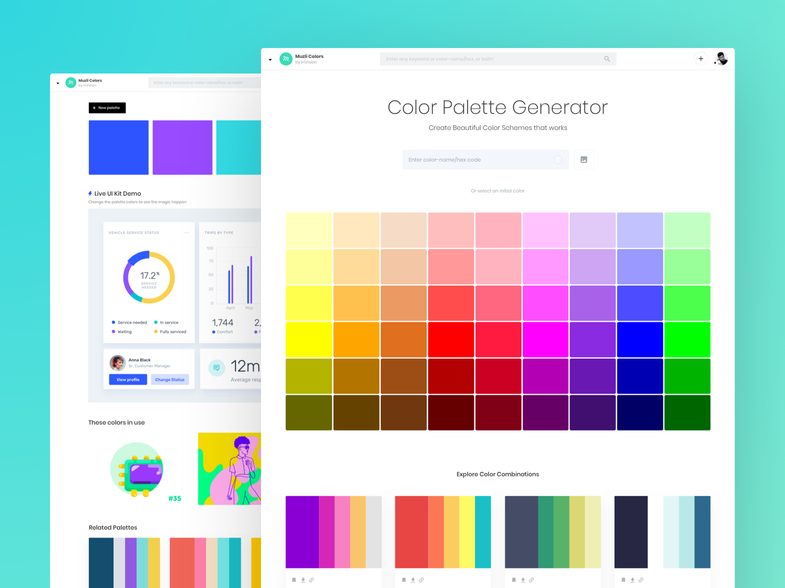
Colour is one of the most important aspects of Interface design, whether it is taking advantage of white space or creating contrast with colours. Different colours can evoke various emotional responses from users and typically gives you your first impression of the design, and when used right the design flows naturally, drawing the user in.

Colour Psychology for Interface Design:
Having an understanding of colour psychology is a key aspect for creating colour palettes that work well. The right colour choice can support better readability and usability, including, strengthening call-to-actions and improving the navigation of your designs. Many companies make colour choices one of their key marketing strategies for interface design, forming unique meanings and connotations. For example, red is energising, signifying power and passion. Red is used throughout the Fonseka Innovations website, aiming to ignite passion in potential clients. The design is encouraging them to choose the team at Fonseka to help reach their full potential in their business.

Why focus on colour?
Using colour wisely means hitting the 5"rights", choose the right colour, at the right time, in the right usage pattern, with the right users, and target the right goals. Why put so much thought into the colour selections for your interface design? Research demonstrates that only takes 90 seconds for users to make a subconscious judgement about your product or service. In fact, it's estimated that between 62% and 90% of this assessment is based on the colour alone.
Colour should not be looked at as an aesthetic choice, colour has functionality and importance when it comes to interface design. French illustrator Pierre Bonnard said it best:
Colour does not add a pleasant quality to design — it reinforces it. - Pierre Bonnard
Using colour may sound scary and intimidating, but it isn't as hard as you think. Sticking to a maximum of three colours in your colour scheme can help your interface attain better and higher results. Colour in interface design focuses on balance, the more colours applied, the more complicated the design will become.
In the end, the best way to improve your use of colours is with practice. Now that you understand the importance of strategically picking your colours you can work towards creating a mesmerising interface that improves your users' experience.
FONSEKA
Contact the team at FONSEKA to start your journey at creating and utilising colour in your next interface.