


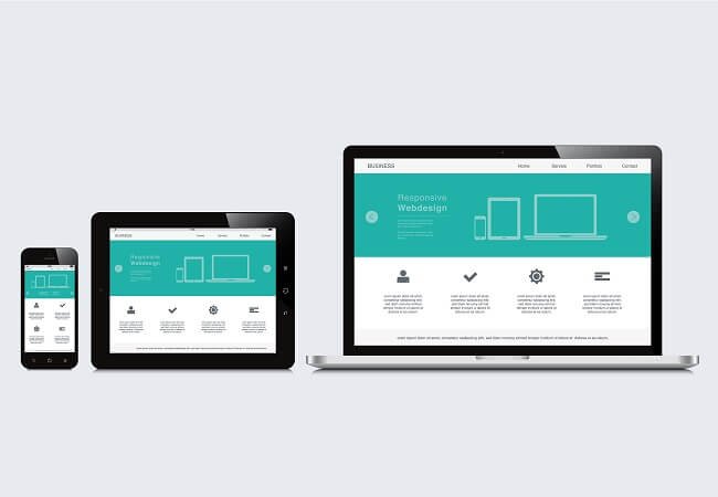
When designing for mobile, its important to consider some tried and tested user experience design principles. These principles are the result of decades of learning and the changing needs of the user as devices and expected functionality change.
Mobile UX Design Principles to follow
Mobile UX (User Experience) can be difficult to grasp when you don’t understand some design principles. You want your mobile design to be intuitive and easy to use. Sometimes, even if the mobile application UI is flawless, the UX can be useless, leading to an unhappy user.

Let’s talk about some mobile UX design principles to think about when designing out your mobile application.
Say Goodbye to Clutter
Providing too much information can instantly lose the user’s attention because they don’t know what to look at first. Especially on mobile screens, there isn’t a lot of real estate to work with. So, removing the unnecessary clutter from the interface will help retain the user’s comprehension.
Before designing the screen, think about the primary action a user wants to be executed and have that one action on the screen. This will reduce the effort required from the user leaving them satisfied with the ease of use.
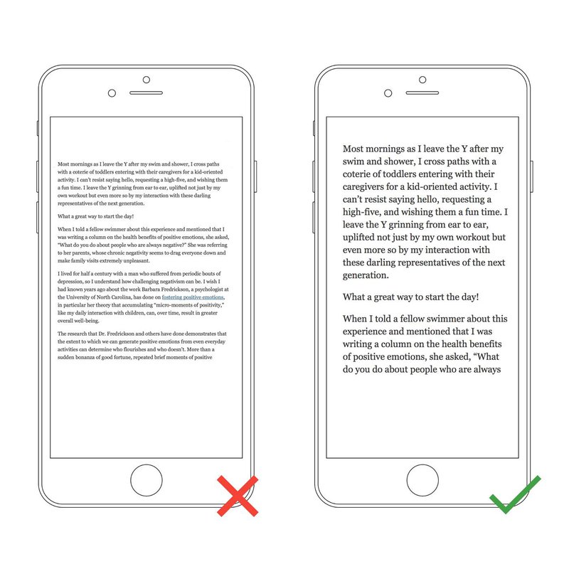
Text Legibility
Mobile devices will have a smaller screen, meaning the design needs to use the screen area efficiently. So the mobile UX design needs to scale the text to be readable. If the user needs to zoom or squint when reading, then your text is too small. Also, keep in mind, line-height can also help improve the legibility of the content.
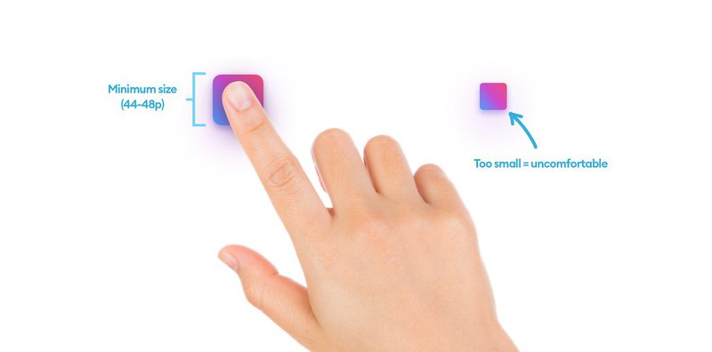
Tappable Targets
Compared to desktops, the clickable areas need to be large enough for users to tap on with their fingers. For example, if a button is too small on the mobile screen, it will frustrate the user, because they won’t be able to click it.
Ensure your buttons are large enough and spaced out for a more user-friendly mobile design.
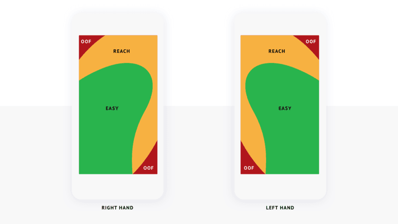
Hand Position Controls
There are certain areas of a mobile device that is considered the Thumb Zone. For mobile UX purposes, the design layout should use those reachable areas for user interaction elements like buttons. This is a major factor as to why almost all mobile applications have the navigation bar at the bottom of the screen.

Minimize Data Input
Autocorrect isn’t always accurate and when users are typing on mobile devices, the data they provide can sometimes be incorrect/bad data. Limiting the number of text inputs in your mobile design for the user will help improve the accuracy of data and ease of use.
And when your application requires a keyboard, try to match the keyboard type to the input type (i.e. Number Input should show a Numpad keyboard).
Seamless Experience
Creating a seamless experience across all devices can be difficult. But when done correctly, it will go unnoticed. There are all types of variables that are taken into account when thinking of a seamless experience. Here are a few:
- Synchronization across multiple devices
- Consistent UI
- Touch ID / Face ID / Biometric Login
- User Content Personalization
Mobile UX Design Principles
There you have it, a few Mobile UX Design Principles to consider when designing and developing a mobile application. Keep in mind, there are more principles than the ones stated in this article, but there’s always more to learn.