

At WWDC 2025, Apple announced a new design style for all their operating systems: Liquid Glass. They described it as “elegant”, “expressive and delightful”, and “a beautiful new software design”. Since its announcement in early June, many have been quick to voice their opinions - mostly mixed and negative. Since then, we’ve seen Apple attempt the refine the UI before launch in the hopes of making it work. Let’s take a look at what Liquid Glass is, what Apple’s goals were for it, how it looked on first beta release, and ultimately how it stacks up now on full release.
So, what is Liquid Glass?
Liquid Glass is Apple’s new design style, replacing the current design of all their platforms. For the first time, all their devices - the iPhone, iPad, Mac, Apple Watch, Apple TV and Apple Vision Pro - will have a unified design language.
While this is a new style, calling it a replacement might not be the best word. It’s not that stark of a departure from their previous design style. We’re not talking Windows 8-level of change here, more like a refresh.
But with that said, let’s take a quick look at the crux of Liquid Glass at it was presented at WWDC 2025: the glass and the liquid.
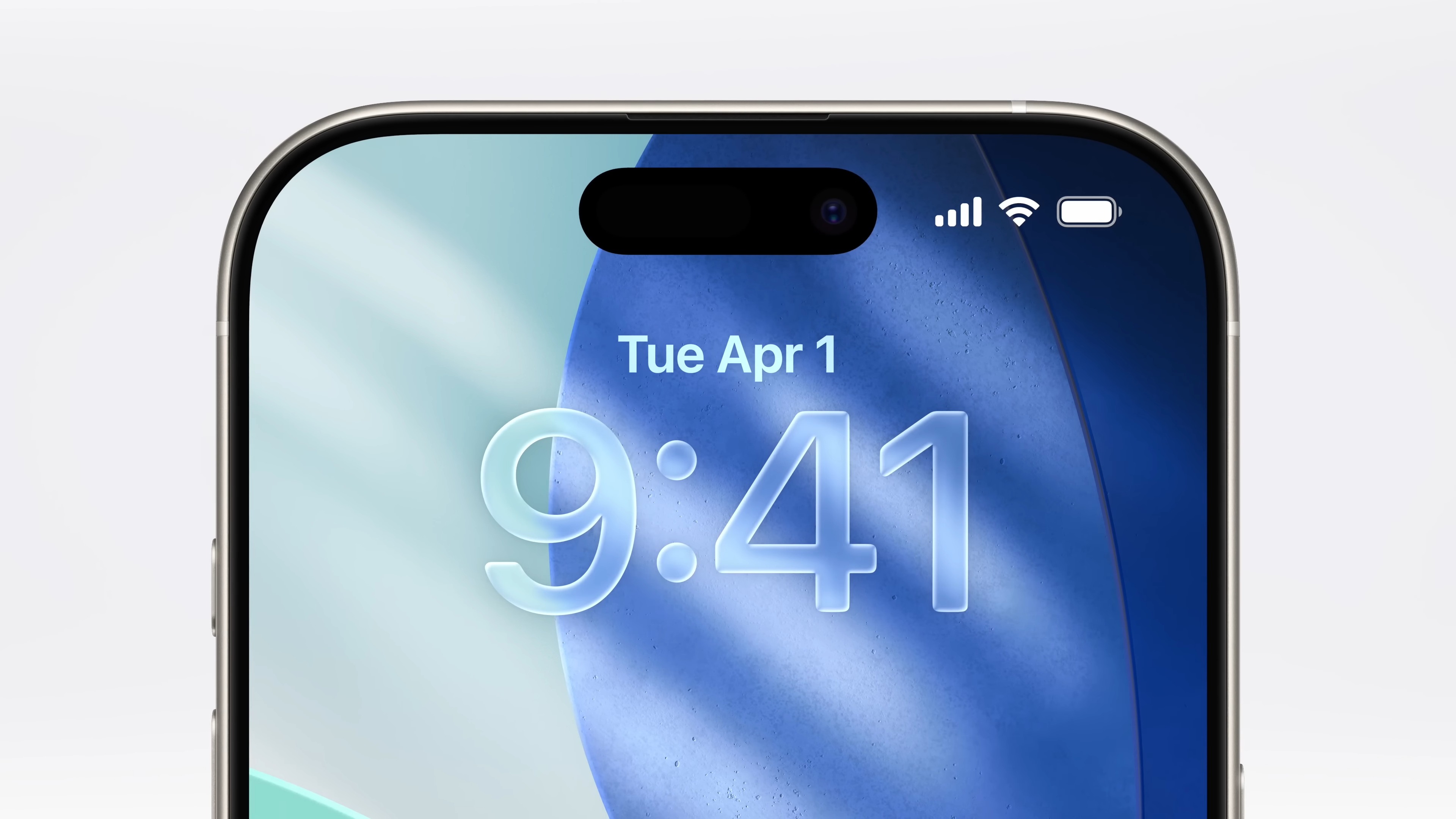
Glass Material
While Apple’s previous design style also contained glass elements, there was a different philosophy behind it. Their previous ‘flat glass’ was expressed as a blur on a semi-transparent shape, which, when it was introduced, may have been all the SOCs at the time could handle.
This new version turns it from ‘flat glass’ to ‘glass-glass’, being based on realistic glass effects. The core differences between old and new are:
- Lower opacity of element backgrounds
- Lower blur on element backgrounds
- A new realistic glass refraction effects around the end of elements.
Together, they combine to create a glass that is true to the physical world - not a flat element that has one glassy effect, but something that actually looks like glass.

An important factor is that app layouts haven’t changed much. You’ll see all buttons in more-or-less the same place they’ve always been, but they are a bit rounder, more transparent and floating away from the edges of the screen. While this might feel like a disappointment for those who were looking for a revolutionary new style, it will ease the transition and retain familiarity with many existing customers.

Liquid Motion
Static elements are not the end, though. As we’ve seen with Material 3 Expressive, motion design is becoming increasingly more common. Many are now using it as the focus of their design in an attempt to give it a unique feel. While Google has gone for in-your-face, Apple has aimed for fluidity.
The main reason for adding this motion is to create a pleasing experience. An interface without transitions or animations doesn’t feel like it has a personality. Traditionally, the personality of Apple software has been smooth and refined, and that’s no different here. In fact, the smoothness has only been increased.
While the glass is busy making the interface look like Apple, the liquid is making it feel like Apple. Arguably, this is the more important of the two as it’s what makes Apple devices feel smooth, elegant and ultimately premium.
And just like with the glass, the new motion won’t feel like an abrupt departure from what you’re used to. Instead, it’s an evolution of something you already know and are familiar with.
What’s the Goal of Liquid Glass?
Throughout WWDC and subsequent interviews, we heard directly from Apple what their goals were for Liquid Glass. The easiest of these to point to are those signposted in the announcement video, but we can discern a bit more from what the did, and didn’t, say.
- To create “a beautiful new design that brings joy and delight to every user experience”. This were the words they used to introduce Liquid Glass, and it is a very Apple thing to want. With Windows 11 refining Microsoft’s design style and Material 3 Expressive aiming to flip flat design on its head, now is the time for Apple to show what they think the next decade of UX design should be.
- Refresh their design language. It’s been many, many years (13!) since Apple last refreshed their design language - all the way back with iOS 7. In many people’s eyes, including likely their own, it was time for them to take another step forward.
- Unify the software of all their devices. All of Apple’s devices have interoperability a their core. But as time passed, interface fragmentation arose. Each OS had their own visual style, and while each felt distinctly Apple, they weren’t harmonious. By syncing each OS version to 26, and developing a new style across all devices, Apple is making it clear the future is unified.
- Move on from Apple Intelligence. It was tempting to use the word ‘distract’, but I’m not sure that’s exactly right. But it’s no secret that the rollout of Apple Intelligence has been strenuous at best. While many Apple Intelligence features have become available, many still have not, and don’t have a clear timeline for release. Whether it was a happy coincidence or a deliberate change of direction, Liquid Glass is the new shiny toy to replace the mismanaged expectations of Apple Intelligence.
The Good and the Bad of Beta 1
As with most of Apple’s announcements, there is a flood of reviews and opinions online. Many appear to love the aesthetics and visuals of the new style, but are concerned with accessibility and readability. As a brief summary of the general consensus of the new styles strengths:
- The aesthetics are on point. Liquid Glass is very Apple, and their implementation shows how they can create genuinely good-looking interfaces. They have not departed jarringly from their previous design style (I’m looking at you, Samsung), instead proving an evolutionary step that won’t alienate those who have become used to Apple’s previous designs.
- The motion design is quite joyful. Apple has always been known for their animations and motion, and this new design turns that dial without being overwhelming. They have retained their motion brand, so users will be right at home with the new motion.
The Not-So Good
That doesn’t mean all things were good however. There were many critiques and concerns about this first iteration of Liquid Glass. While the liquidity seems to be well-received, the glass garnered mixed reviews.
Readability Inability
Since so much of the interface is transparent, it can be easy for content to become unreadable. There’s an inherit need for some sort of opaque background as, without it, text can be easily obscured by what’s behind it. Apple’s previous design style was much better at this as it was a flat design with some semi-transparent components that had significantly blurred backgrounds.

One of the ways Apple has attempted to fix this is to dynamically change the theme of the UI components as the content of the page changes, ensuring the background of the glass always allows the content to be readable. While this does assist readability, it seems that some of components are ‘linked’ together, so all components in a group change their theme together. This can quickly become a problem in situations where the background content is half-dark and half-light.
Distractions by Actions
When the interface is static, all is fine. While in motion however, some of the new glass effects can cause distractions. When scrolling a page, especially slowly, it’s possible for the UI controls full focus from the content.
The most significant of these is the dynamic theming that aims to increase readability. Having this changing constantly can be distracting, and while in most circumstances it might be easy to disregard the interface, it’s likely the edge cases won’t be as rare as Apple might be hoping for.
Another distraction comes from the glass refractions. As components behave like regular glass, backgrounds are morphed and stretch, sometimes making content underneath look up-side-down. These effects can cause some busyness when static, but once you start to scroll, their irregular movement and distortions can once again become a distraction.
Potential Performance and Power Problems
In an interview with The Wall Street Journal, Craig Federighi was asked “why do [Liquid Glass] now?” to which his response was:
“Well, we’ve gotten to the point where the hardware has evolved ... like doing refraction of content that’s far away from the glass, along the edges of the glass, transmitting content through the glass ... This is all computationally intensive, but we have now the power with Apple Silicon to do this across the breadth of our product line.”
When I listened to this, the first thing that came to mind was Windows Vista. One of the core problems with Vista was running it on hardware that wasn’t designed for it. Sure, computers “built for Windows Vista” worked pretty well, but older computers struggled to compute and render the glassy Aero effects. Modern Apple devices are far-and-away more than capable of rendering these effects without a hitch. However, that doesn’t completely alleviate the concerns from Federighi’s comments, especially on older devices.
The other concerns however and those of battery life, performance and thermal management. Excess effects has the possibility of reducing the effectiveness of any of these, so while day-to-day tasks might not feel a hitch, it is currently unknown the extend of the effects. In all likelihood, this will be a non-issue, but that doesn’t mean the question shouldn’t be asked.
What needed to change from Beta 1?
At the time, in my option, there were three things Apple needed to do to improve Liquid Glass. With that first version, ‘most’ interactions are probably fine for ‘most’ people, but disregarding the needs (or even preferences) of part of their user base would not have been a successful strategy.
- Turn up the contrast. For some elements, there needs to be a clear separation between content and controls. In these circumstances, readability must come first. Turning up the blur, or down the transparency (or both?) will go a long way to improving the contrast between foreground and background, ensuring all controls are easily readable.
- Reduce Refractions. The refraction effect, especially that showcased above in Apple Music, is too distracting. Reducing the size to be relegated to a thin outer border will help reduce visual distractions, especially while scrolling. These effects are quite beautiful for a modern aesthetic, so a priority should be to keep them. It’s just that fixing them should be higher.
- Solve Theme Changes. A significant add to the distraction is the theme changes as you scroll through dark and light content. This is ultimately an attempt to fix the above contrast concerns, but itself adds distraction. Without theme changes, the contrast problem becomes far worse, so any changes to this will have to consider that first. Currently, these changes are far better than not having them, but Apple should really explore other options.
What Did Change?
Since the first beta, we’ve seen Apple refine the Liquid Glass appearance. While they haven’t backflipped - like some where hoping - they have made some accessibility improvements to the effect. Here are three key examples:
The Control Centre is more Readable

In Beta 2 and beyond, Apple has increased the background blur and the opacity of the buttons, and further refined this throughout subsequent betas. This has decreased the noise and busyness of the interface while also decreasing the risk of individual buttons becoming unreadable due to lack of contrast. Interesting, they have gone for white icons on a light background, which seems counter-intuitive for accessibility and contrast.
Lock Screen Notifications are more Readable

Another darkened part of the interface is on the lock-screen. Apple has now added a shadow behind the notifications to help each of the Liquid Glass components pop from the background. Even though this example has an already-favourable background, you can still see how this is an improvement.
Performance and Battery Life has improved
After Beta 2 was released, there was a test conducted by In Depth Tech Reviews on YouTube which showed, at that point in time, iOS 26 has significantly worse battery life than iOS 18. This was not completely unexpected though, as optimisations generally come after the phase of significant changes have finished. However the discrepancy was concerning, even though it is one datapoint and was not a true scientific test.
As we progressed to Beta 9, we did see improvements in both battery life and performance, and it appears that discrepancy has significantly shrunk. That doesn’t mean it has completely gone away however. Liquid Glass effects are still inherently demand more power - and there is no way around it - but it appears Apple has done an excellent job optimising the effect to what might be a minimal impact. Of course, we will have to wait and see after wide-scale adoption how this is in the read world.
The Future of Apple’s Liquid Glass
Throughout the 8 betas since, Apple has either tweaked, temporarily rolled back or improved the readability of their interface. With Liquid Glass hitting real-world devices now, we’ll get to see however the everyday public feels - especially those who haven’t been following this saga since June.
One thing has stood out since the initial beta of Liquid Glass: the effect is a lot less pronounced now. In-fact, in some areas like the Control Center, it’s hard to tell the effect exists at all. This is great for those who struggled to read up components, but Apple does run the risk of delivering short of their promises for the second year in a row. The question does arise: was it worth it?
Now it’s basically what we have now, just a bit less blur, a bit more rounded and with specular highlights on the edges. A far cry from “the most substantial redesign ever”
- dinopraso on Reddit, commenting on Beta 2’s refined style
Final Thoughts
So where does that leave us? It appears that, like many were expecting, Apple did not backtrack on Liquid Glass. However they did attempt to address concerns and take a step back on some of the more aggressive styles. But remember: when iOS 7 was first announced and released, many of these same concerns were present there, and in the end it turned out alright.
It just appears we are once again down this path.
The good news is that Apple has given developers a simple way to get their apps up-to-date with the new styling, meaning third-party implementations shouldn’t be too inconsistent.
But for everybody else: it looks like we’re back with iOS 7. Some things aren’t great, others might struggle with the readability issues, but many might think it’s a great refresh for their phone. If you need, you can disabled many of the Liquid Glass effects, but here’s hoping this is a temporary solution to a temporary problem.